About three years ago, the SymSoft Design team started to design our products and client solutions in an increasingly systematic fashion, looking at the whole map of the interface, rather than individual pages or components. We didn’t know back then that this would become, de facto, the standard way we approach every interaction design project. Fast forward to today, and a few successful projects later, the clients themselves expect a design system — or at least a pattern library — in place, in order to maintain brand experience across multiple digital channels and properties.
The benefits of creating a cohesive, yet reusable system are endless. Be it a full-blown design system, a style guide, or a pattern library, thinking systematically means thinking future proof.
Systematic approaches to design require tighter collaboration and sharing between different functions, primarily the brand managers, designers of all stripes, and technology folks, but also product owners, program managers, and executive stakeholders. Thankfully, there are a few solid software solutions to choose from that can make the process more seamless.
What follows is not a comprehensive list of tools, but rather a list of selected tools that we anticipate will soon become mainstream digital product design tools if they aren’t already. In this article, we will take a look at:
- Adobe XD
- Figma
- InVision Studio
- Sketch
(Other existing tools might be as valuable as the ones that made it to our list. We would definitely like to hear about your experience and learn about the advantages of other solutions.)
Before we dive deeper into why we like each tool, it’s important to remember that we are a tool-agnostic design team, which means that everyone gets to choose the best tool for a job, as long as they can export it to a common format and share it with the rest of the team. And yes, sometimes we will go into Keynote to quickly mock up a series of screens, or even design a high fidelity interface.
Overview of Tools
| Adobe XD | Figma | InVision Studio | Sketch | |
| Learnability | Easy | Intermediate | Advanced | Easy |
| Platform | Mac, Windows | Mac, Windows, Linux, Web | Mac, Windows | Mac |
| Advanced Prototyping | Basic Animation, Screen Recording | Basic Animation, Animation Preview | Advanced Animation | Basic Animation |
| Collaboration | Share and Comment | Live Collaboration | Live Collaboration with Freehand | Available with Plugins |
| Code View | Link | Code Mode | Link | Available with Plugins |
| Component Reusability | High | High | High | High |
| Export / Compatibility | jpg, png, pdf, svg | jpg, png, pdf, svg | jpg, png, svg | jpg, png, pdf, svg, tiff, webp, eps |
| Convenient Sharing | Share for Review / Development | Share Source File / Prototype | Share Prototype on InVision | Share on Sketch Cloud |
Adobe XD
| Year of Release | 2019 |
| Download Link | https://www.adobe.com/products/xd.html |
| Tutorials Link | https://letsxd.com/?promoid=8WLD53GJ&mv=other |
| Brands that Use it / Popularity | Microsoft, Dropbox, AT&T, DICE, SONOS, etc. |
| Roadmap / Future Features (from Adobe Blog) |
|
Why we love it?
Adobe XD is the newest among the four tools mentioned in this article. It easily made its presence known because it was originated by Adobe, probably the most well-known design software ecosystem. We have built products in Adobe XD for previous projects that include websites and design systems, even for large organizations like CalPERS. It’s useful for communicating with clients and building design systems, and also easy to learn and adapt to.
Convenient client communication
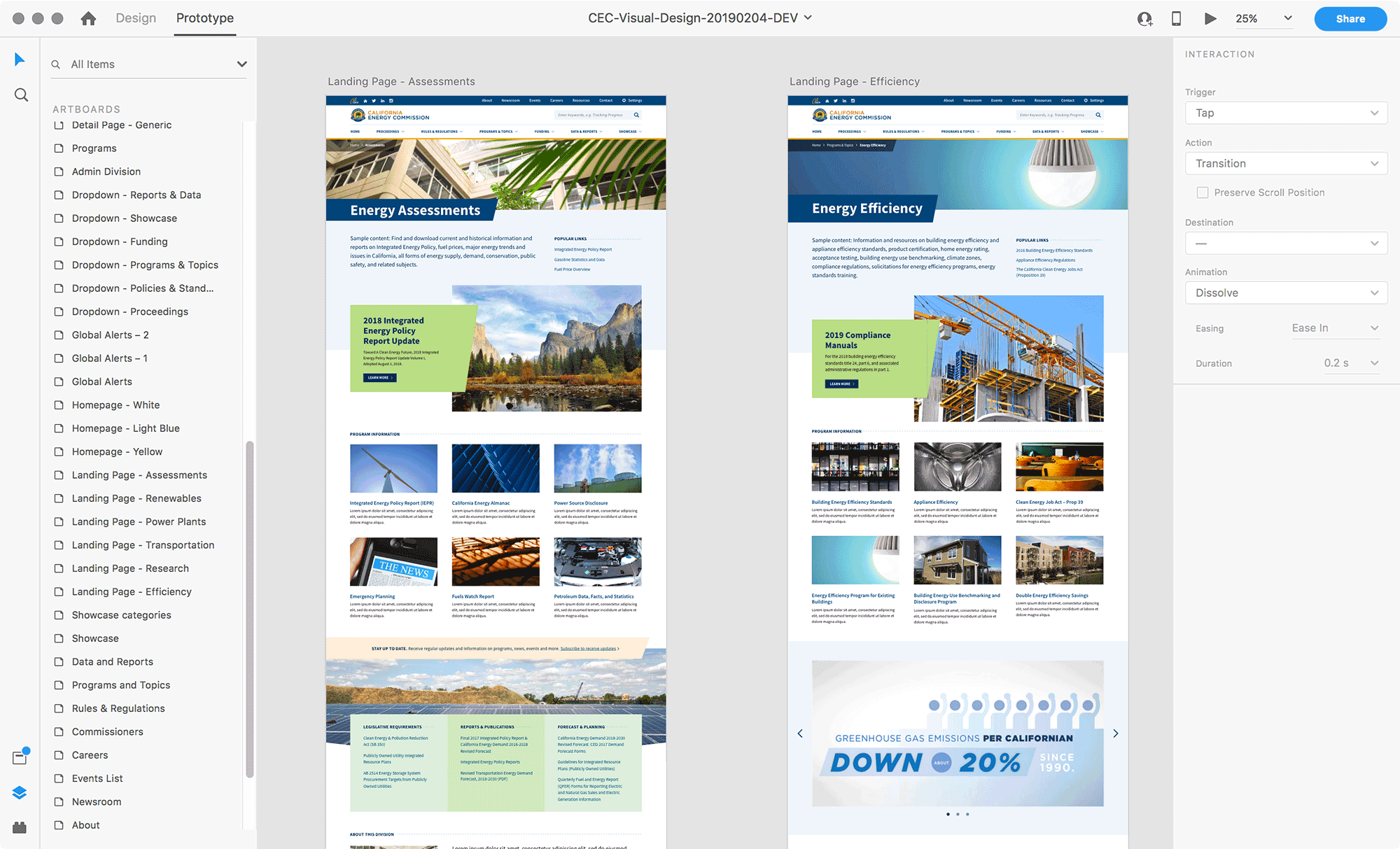
All the design software mentioned in this article has a sharing option. Adobe XD supports two types of sharing — Share for Review and Share for Development. We use the Share for Review to receive client feedback, especially because they can annotate the prototype screens and add comments, whereas the Share for Development is intended for developers to view the code.
Adobe XD stands out for us as the most convenient for client communication because it’s the only one of the four that allows users to comment without signing up for an account. Another welcome feature is passcode protection, which keeps our projects more secure.
XD also has the most convenient prototype recording capability — accessible through a button in the top right of the preview window, with which designers can easily record the interaction and send it to the client for review.
Good for building design systems
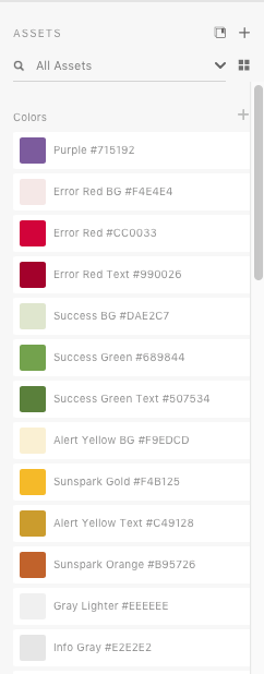
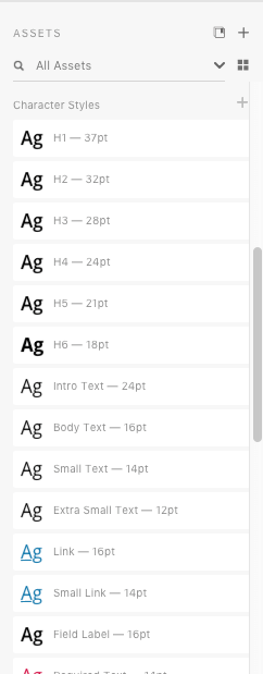
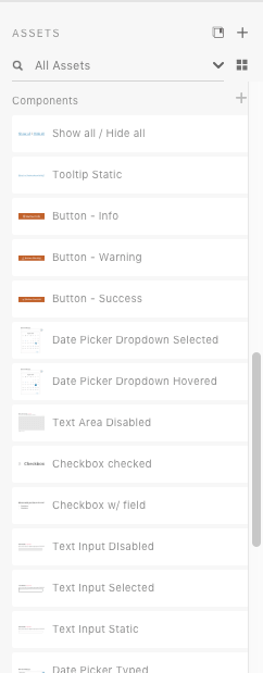
The assets panel of Adobe XD makes it unique compared to the other three tools by having reusable components as well as colors and character styles all in one place. As a result of utilizing this, we can easily build a component library and a style guide consisting of the color and type systems.
Moreover, Adobe XD supports linked assets. This enables designers to import assets from an Adobe Cloud document and simultaneously use and update those assets across different projects. This was especially helpful when we were building the aforementioned design system for CalPERS. The ability to import linked components, colors and typography styles altogether into documents dramatically improves the workflow and keeps all the styles up-to-date.
Zero learning curve
We found Adobe XD the easiest to learn and adapt to, especially for those designers who have experience using other Adobe products, namely Illustrator and Photoshop. With almost identical shortcuts and a very similar look-and-feel (for example, tools panel on the left, in vertical order), it reduces the learning curve for any experienced designer.
What we miss?
While XD is great for easy client communication and feedback, building design systems, and is easy to learn, there is room for improvement in the prototype mode.
Advanced interaction
Currently, XD only supports basic interactions such as tap and drag (by mouse). It doesn’t allow more advanced triggers like mouse over, double click, or swipe to different directions.
However, one thing to note is that XD is the only tool among the four that has a voice trigger, which is handy for prototyping conversational user interfaces. For example, Siri, Alexa, Google Home, and many more applications and devices are using the voice user interface to improve the overall customer experience.
Better connected design and prototype modes
Another potential issue with XD is that it separates the design and prototype modes in a way that sometimes stifles the workflow and makes our process disconnected.
For example, imagine this task — we want to create a menu bar component in the design mode that directs us to the same artboards wherever we use this component. In XD, it’s hard to accomplish that because when we switch to the prototype mode after we designed and used this component, we need to link everything over and over again.
Better artboard organization
XD only supports a single page with multiple artboards, whereas other design software usually supports multiple pages with multiple artboards. This could work for smaller projects, but for larger projects that need to be more organized, a single page might not be sufficient. Keeping a large number of artboards in one place could make it difficult to organize and navigate.
Figma

| Year of Release | 2016 |
| Download Link | https://www.figma.com/downloads/ |
| Tutorials Link | https://www.figma.com/best-practices/ |
| Brands that Use it / Popularity | Twitter, Dropbox, Zoom, Microsoft, Github, etc. |
| Roadmap / Future Features (from Figma Editorial) |
|
Why we love it?
Figma stands out from other design tools by offering access on different platforms — Mac, Windows, Linux, and most importantly, the Web. According to its CCO, Amanda Kleha, Figma actually originated from the idea that “design should live on the Web.” Figma is unique in its ability to store everything in the Cloud so that the team can always find the latest version. It also offers a few other benefits that we don’t find in other tools including live collaboration, interaction preview, and instant code mode.
Highly collaborative
Unlike other design tools that follow the share-comment structure for collaboration or communication purposes, Figma takes a different approach by offering the live collaboration feature. In other words, it allows multiple users to work on the same file at the same time. This feature may seem strange for some users, but it could be useful for projects that need several designers working on the same file.
We are under the impression that Figma is striving to build a highly collaborative environment for users because the Comment feature is built into both design and development modes — it’s even highlighted in the top tool panel to make communicating handier. Commenting can be “live” too. When multiple users are working on the same document, they are able to give feedback and respond to comments with a single click.
Animation preview
We simply love this feature! When comparing the animation and interaction features among these tools, we realized most of them have very similar capabilities and logic. But what makes Figma unique is that it offers previews for animations. This increases the learnability of this tool and is especially helpful for those who are relatively new to the animation terms.
Three unique modes
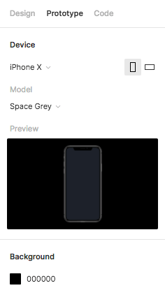
While other design tools primarily have two modes for users to work in — Design Mode and Development Mode, Figma also incorporates a Code Mode. In the Code Mode, when we click on an element, we are able to see its CSS, iOS, and Android code without an additional step.
In this case, designers and developers have a chance to learn from each other – designers getting more familiar with code, and developers can always have the most up-to-date design file to build the product from.
What we miss?
In general, Figma is a very powerful design tool because I cannot say there is one thing about it that significantly bothers me, so here I would like to mention several aspects in which it can be improved.
Local copy
Unlike other design tools that allow users to save files into local drive, Figma takes a different approach by storing everything on the Web. This is good because everything is auto-saved and the teams always have access to the updated files. However, for teams working only in the Cloud, this could be problematic because everything is based on the Internet. Basically, if there’s no Internet connection, there’s no progress.
Privacy
Figma’s emphasis on the Web could also be a potential issue in terms of privacy. Organizations might fear that putting their projects and collaborating in the Cloud would be less private.
Another issue is that some designers might prefer working on their own and don’t want others to see what they are working on currently. In this case, Figma’s live collaboration feature might not work for this group of designers.
Layers Organization
The pages, artboards, and layers panel on the right of Figma’s design interface could be a little clearer and more legible. There could be a more obvious separation between pages and artboards. Also, Figma doesn’t have the option to search for specific layers, as XD does. For a large project that involves multiple pages and artboards, searching for specific layers to make a change could save us some time.
InVision Studio
| Year of Release | 2018 |
| Download Link | https://www.invisionapp.com/studio |
| Tutorials Link | https://www.invisionapp.com/studio/learn |
| Brands that Use it / Popularity | Stripe, Airbnb, Amazon, Slack, Lyft, HBO, IBM, Netflix, CapitalOne, etc. |
| Roadmap / Future Features (from InVision Talks) | Major investments into tools and collaboration fragmentation, version management, company-wide source of truth. |
Why we love it?
InVision has been extensively used as a powerful prototyping tool combined with other interface design tools to help design teams achieve intended results. It released its own design tool, InVision Studio, in 2018, so now we can design and prototype on the same platform. Since InVision was famous for being a prototyping tool originally, InVision Studio keeps this advantage by offering many powerful animations and interactions. Moreover, InVision has developed its own design collaboration suite, which makes it the most complete solution on the market today.
Rapid prototyping
InVision Studio is no doubt the best in terms of prototyping among all the design tools on the list. It allows interactions triggered by mouse, finger, keyboard, and timer. More options, such as hold tap and double-tap, which are not seen in other design tools, are also available in InVision Studio.
Prototyping has been made simpler in Invision Studio also because we can add interaction at any point without switching to a prototyping mode. Another convenient feature is an automatic frame (iPhone, iPad, etc.) when we prototype screens, unlike Adobe XD that needs us to manually add frames.
Advanced animation
Besides rapid prototyping features, InVision Studio also offers advanced animation capabilities. For example, after we set up a motion transition to an artboard or layer, we can take a step further by using the Edit Timeline function to have more granular control over the speed and timing of each component that we want to animate. In this case, it allows us to create more customized animation to fit our needs.
InVision ecosystem
InVision has developed its ecosystem by offering a complete solution including design, prototyping, workflow tracking, design handoff, and advanced animations. For teams working on a complete product building cycle, InVision offers complete support from planning, to design, to communication, to delivery.
In the early stage of the product cycle, we can use InVision Boards for inspiration and ideation. When we want to create storyboards, low-fidelity prototypes or collaborate with other team members, we can use Freehand to help with the workflow.
What we miss?
With powerful design prototyping features all in one mode, InVision Studio’s interface appears to be more complicated than other tools. Thus, it can be improved in its usability and performance.
Relatively low learnability
InVision Studio is different from other design tools, first, in its look-and-feel: it features a dark theme and a futuristic style, which might be hard for some users to adapt to. The tool icons are also not very intuitive so it takes time to learn how each of them functions.
Better panel usability
InVision Studio somehow sacrifices its usability for the sleekness of its interface. For example, it doesn’t have a very clear tools panel like other design software does; rather, we need to perform an additional step by clicking on the “add” icon first to see what tools it has.
Another example is that it only has an alphabetical list of components. You have to click on each component to see what it is, whereas all other software provides previews of the components.
Interaction indicators
Unlike other design tools that separate design and prototype into two different modes, InVision Studio has only one mode that incorporates the interaction feature. Some people think this is more convenient because you don’t have to switch between the two modes. However, InVision Studio doesn’t provide enough indication for already created interactions – we need to click on each layer or artboard to see if it has interactions that have been previously set up.
Sketch
| Year of Release | 2010 |
| Download Link | https://www.sketch.com/get/ |
| Tutorials Link | https://www.sketch.com/docs/ |
| Brands that Use it / Popularity | Apple, Facebook, Google, Nintendo, Porsche, Stripe, etc. |
| Roadmap / Future Features (from Sketch Blog) |
|
Why we love it?
Sketch revolutionized the way we design user interface when it was first launched in 2010. After that, a number of different design and prototyping tools inspired by it appeared on the market. Although there are many tools out there that have their own advantages, Sketch still keeps its place as the top-used user interface design tool today, according to UXTool’s Design Tools Survey. Sketch not only has robust functionalities for interface design but also has the most extensive plugins and resources on the internet.
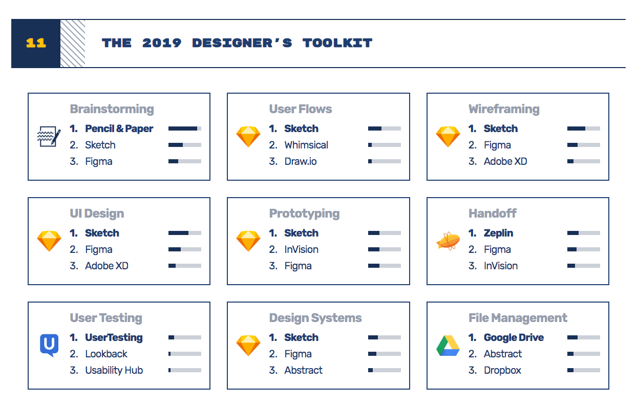
According to UXTool’s 2019 Design Tools Survey, Sketch was rated as the most used tool for user flow, wireframing, UI design, prototyping, and design systems.
Customizable Toolbar
One feature that sets Sketch apart from other design tools is its customizable toolbar. The other tools on the list all have a default toolbar either on the top or to the left of the interface. This convenient feature allows designers to choose what tools are in the toolbar, providing a custom fit to different design habits, and the ability to tailor it to different design needs.
For example, a UI Designer might stay with the default toolbar options, but a Graphic Designer or Icon Designer might want different toolbar options that are more suitable for vector arts.
Extensive Resources
Since Sketch is the very first design software that’s created for user interface design, it has the most extensive resources on the Internet for us to learn and use. There are many different websites focusing on providing Sketch resources to download, including Sketch App Resources, Sketch Repo, etc.
Not to mention, it also has massive third-party plugins to improve its functionality and performance. For example, we can combine Sketch with advanced animation plugins to make better prototypes and we can use third-party plugins like Zeplin for design handoffs. This advantage is very important because we can mix and match plugins to create our own Sketch to best fit our needs.
Templates
Sketch has another convenient feature called Templates, which allows us to create new files from a template, including Android icon design, iOS app icon, material design, prototyping tutorial, smart layout tutorial, and web design. Using a template to create designs can save time when figuring out the correct dimensions, grids, layout options, etc.
What we miss?
Although Sketch has powerful design features and is the most-used interface design tool, it’s still not perfect. There are multiple ways it could be improved in order to be used by more people and to create a more seamless user experience.
Other platforms
Unlike other design tools on the list that support at least two platforms, Sketch is a Mac-only application. Its strongest rival, Figma (Figma was rated number two in the top-used user interface design software survey in 2019), supports four platforms: Mac, Windows, Linux, and the Web, which makes it accessible from almost all platforms available.
Version control
Another feature we miss in Sketch is version control. It’s highly dependent on third-party plugins, such as Abstract and Plant, for versioning. On the other hand, Figma has a built-in feature called Version History, which allows users to see all the auto-saved versions and enables the retrieval of earlier versions. And for those who prefer intentionally saving a version of the file, Figma also allows for manually saving a version.
Collaboration features
Although Sketch has a powerful plugin library, it’s still easier to have built-in collaboration features. Currently, Sketch doesn’t support sharing, commenting, real-time collaboration, or design handoff, whereas other design software has these features built-in. However, according to “What’s Next for Sketch in 2020?” it plans to launch built-in collaboration features this year.
Conclusion
The launch of Sketch has inspired more creation and development in design software. Each tool has its own pros and cons, so organizations can choose what tool to use by analyzing the budget, project scope, and design need. Hopefully, this article can provide a new perspective to your understanding of these design tools and help you choose the right tool for you. Please let us know what you think of these tools. We’d love to hear your opinions!
FYI, SymSoft is currently hiring Interaction Designers. If this is you, our team is eager to meet you!
(md, cm, yk, ma, xl)
Resources
- Best UI Design Tools 2019: Your Guide
- Figma vs InVision Studio
- Adobe XD vs Sketch, InVision Studio & Figma (2019’s In-depth Comparison) Which one?
- Figma vs InVision in 2019 – Comparison UI Design Tools
- 2019 Design Tools Survey
- Learn and Master Adobe XD
- Figma Best Practices
- Learn Sketch
- Master the Power of InVision Studio

